African American Health Data
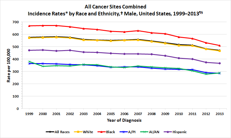
The graph below shows “incidence rate” of cancer among men in the United States, which means how many people out of a given number get the disease each year. The graph shows how many people out of 100,000 got cancer each year during the years 1999–2013 (2013 is the most recent year for which numbers have been reported).
The cancer incidence rate is grouped by race and ethnicity. The graph shows that in 2013, among men, Black men had the highest rate of getting cancer, followed by white, Hispanic, Asian/Pacific Islander (A/PI), and American Indian/Alaska Native (AI/AN) men.


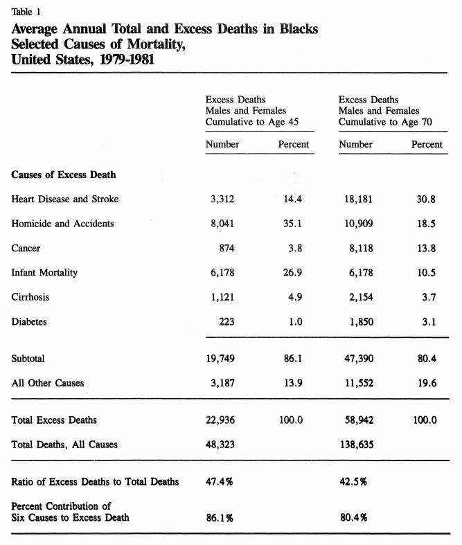
The Report of the Secretary’s Task Force on Black and Minority Health, U.S. Department of Health and Human Services, 1985
“Excess deaths” are the difference between the number of deaths that occurred in minority populations and the number of deaths that would have been expected to occur if the minority populations had the same death rates as the white population. In 2005, more than 83,000 deaths per year among Blacks could have been avoided if we had eliminated the Black-white mortality gap.
Breast cancer is the second leading cause of cancer deaths among women in the United States. Breast cancer deaths are going down fastest among white women. Black women have the highest breast cancer death rates of all racial and ethnic groups and are 40% more likely to die of breast cancer than white women.
Many factors contribute to this difference—
- Black women often have cancers that grow faster and are harder to treat.
- Black women often have fewer social and economic resources than other women.
- Black women are less likely to get prompt follow-up care when their mammograms show something that is not normal.
- Black women are less likely to get high-quality treatment if they have cancer.
